Building My First Live SaaS Analytics Dashboard
The Learning Spark
Grabbed a Kaggle SaaS dataset and wondered: "Can I make MRR trends update live?" That's how my Google Sheets → BigQuery → Looker Studio journey began - a hands-on crash course in data pipelines.
Wrestling the Data
Week 1 Chaos: CSVs fought back with schema errors and null values. Added helper formulas in Sheets, cleaned in BigQuery. Data finally flowed.
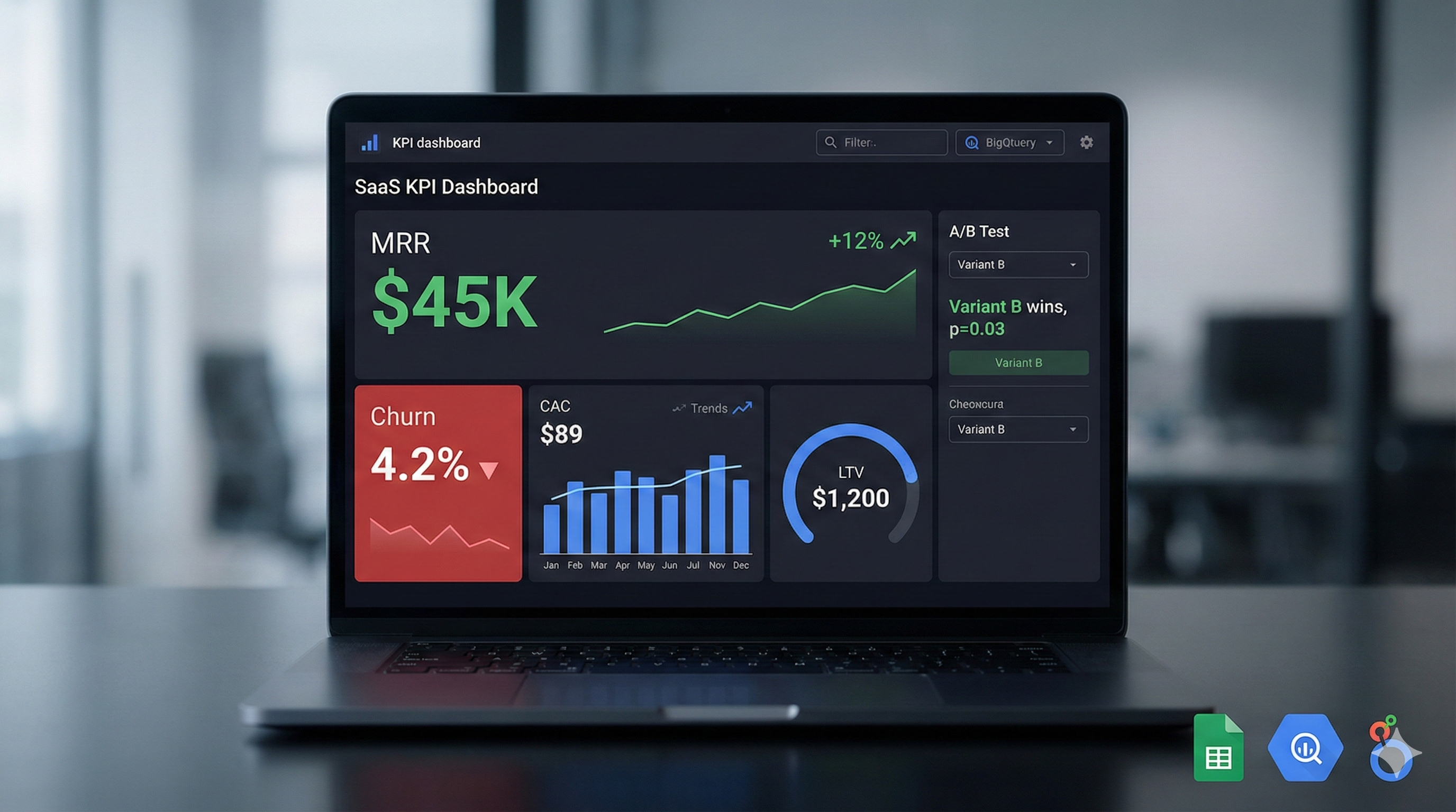
Week 2 Magic: Looker Studio lit up - MRR scorecards, churn trend lines, CAC/LTV gauges. A/B panels showed z-tests proving statistical significance.
The Victory Moment
When filters refreshed live and p-values responded to sample size changes? That's when raw data became executive storytelling. Now I see why SaaS teams live in dashboards.
Tech Stack Mastered
- Google Sheets: Data wrangling
- BigQuery: Schema battles won
- Looker Studio: Live visualization
What Stuck
Data pipelines transform numbers into business narratives. From CSV chaos to C-suite insights - that's analytics power.